USA Shops - the Good, the Bad & the Ugly Part 1

During April 2014 I have the opportunity to visit the USA to attend a couple of conferences. During the visit I also took some time out to visit retail shops in Las Vegas, Los Angeles, New York and Atlanta. I utilised the Westfield Retail Tour summary of shops that they visit during their annual roadshow to help build out a strong list of shops to see around New York specifically. My objective was three-fold:
- Get a real handle on how US shops create instore experience from the windows, to the design and fit out through to any experiential activity instore
- What technology are they using and how can this be adapted to other markets
- What selling techniques did I observe
The following is a log of my journey across the Shops of the USA and what I saw and experienced. Part One are the 'good' shops, those that are doing something different and unique. Part Two will cover the other shops that I discovered, some good, some not so good.
What I did find out was interesting:
1. There is a strong sense of creating an experience instore. Great locations and use of old buildings. Top fit outs, brilliant window displays to create icons and experiences instore along with the actual product.
2. Sales and customer service is very poor. Staff greeted you, but we're really about security. It was impossible to find staff within the shop to assist and no one attempt to sell to you. You were then herded down long checkout areas and expected to wait. While the icons and fit outs are inspirational, the staff and the process to buy did not complement this experience.
The only exceptions were Disney, Bigelow & Nespresso were you were approached in a very direct way (no Friedman here) but provided service, upsold and closed.
3. Technology was virtually non existent. The only place I saw technology in work was at the Apple store with the wireless POS and at Puma with the iPads. Later on in LA we saw a Telsa dealership in a mall and they have a full interactive display to sell to customers. Otherwise all others wanted you to queue to buy. In a lot of way this is why Apple is considered cutting edge.
Cosmopolitan Hotel
The theme of the hotel was right across the property, from the signage, to the feel, to the casino & the rooms. Hip and a bit naughty with lots of fun. What impressed me was the use of the digital signage at reception and the lifts. They are just standard TVs joined together with deep, relevant imagery that inspired you in the theme
High End Fashion at Caesars Palace
Really neat lines with a good use of clean and clear space around stock in the high end fashion houses. Really liked the usage of windows as it gave the product room to breathe. Some of the large windows featured a small window outside of graphics to display the item...very effective. External signage also complemented the brand experience.
Ramsey's Steak
Enjoying evening at this restaurant. The theme commences at the entrance with mini skirted girls escorting you to your table. You enter through the 'Chunnel' and we went upstairs. From here we had a view of the entire restaurant. The theme of modern Britishness continued right across the fit out and clothing worn by the staff. The additional experience was the way that the steaks were presented. They bought a tray out with fresh cuts of meat as the 'menu', explained them and we ordered. Really great ambience & experience combined with a perfect fit out to complement.
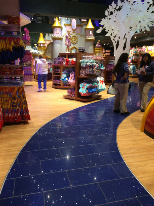
Disney
This brand really does try to make the experience 'magical' for children. This brands also was one of the only brands that sold. Staff were on the floor working with customers to explain product & to upsell. At the checkout we were wished a magical day!
They had grouped similar coloured merchandise together to create visual categories. Clear delineated walkways take you past all of the merchandise with the stock clearly at the child's level. They also creatively used lighting to highlight stock and to project images onto the walls and onto the displays
The boy area had more physical play areas - cubbies etc, in the girls areas more imaginative - castle with mirrors. Play areas had been constructed including a drawing area.
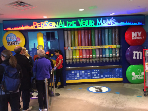
M&Ms & Hersey
As soon as you enter the stores you can really smell the chocolate. Both have great external and internal signage & due to the product can really create colour themes.
At Hersey the experience was to taste some chocolate and to walk through the merchandise.
At m&ms the experience was higher. You could create you own personalised m&ms and also find out your mood colour. It seemed that they had merchandised anything they could! This store lacked the Nascar at other locations, which is a draw card.
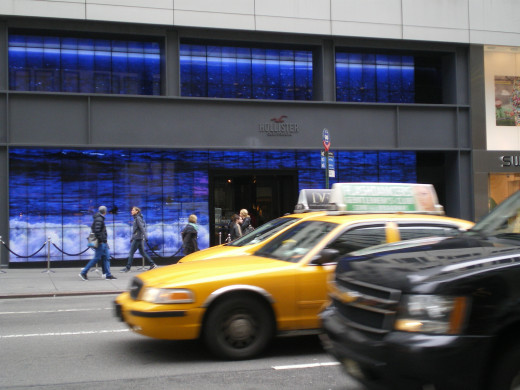
Hollister
I've been to Hollister before and been impressed with the live images of Huntington Beach inside the store. At this location the entire frontage is a live feed from Huntington Beach! It stands out and is so different. On Saturday there was even a queue for customers waiting to enter...no recession at this store.
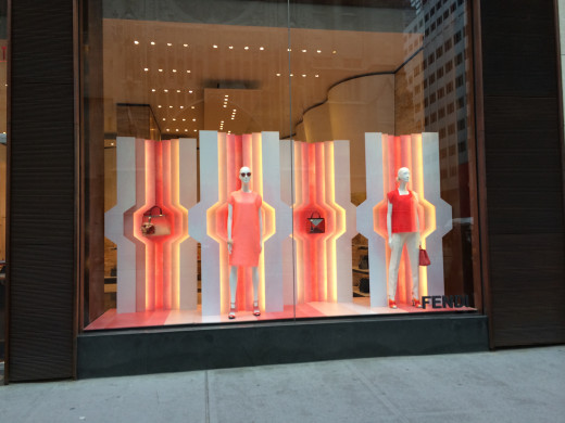
Fendi
What I loved about this shop was the inspirational and simple window displays that displayed one stock item. It inspired you to enter and gave aspirations that maybe one day you could afford the product or start coveting it today.
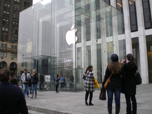
Apple
This is innovation in store design. Apple have taken over a square, cut a square hole in it to open up the basement & 3 levels and then placed a glass cube over it. So very cool. The design shows that it is hip, cool, inspiration and leading edge. Inside was chaos with hundreds of people, mostly under 30 looking at product and waiting to speak to the Genius team. The only place that I saw the use of technology in Retail stores across the US except for normal POS.
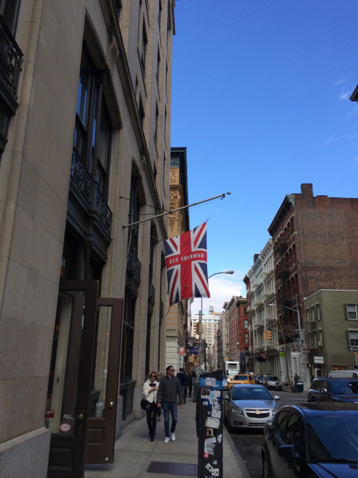
Ben Sherman
In the high end fashion district Ben Sherman doesn't have a traditional sign, but a Union Jack flag with the brand name inserted. Clever way to promote the brand and to display hipness

Agent Provocateur
Wow! They created the shop the shop to look like an Amsterdam brothel to promote their lingerie ranges. It really catches the eye and shows the cutting edge nature of the brand
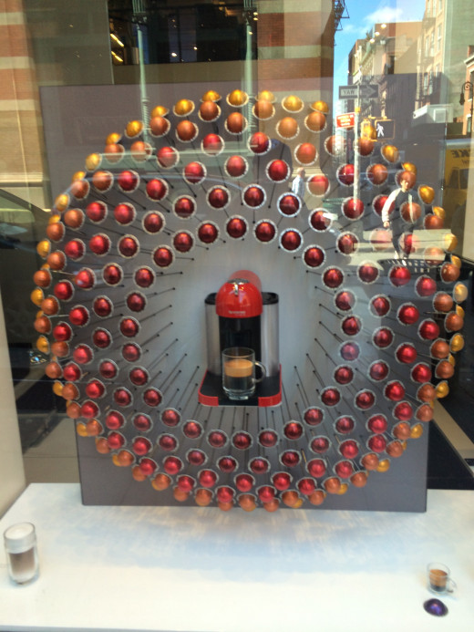
Nespresso
This brand has not resonated in the US as compared to other parts of the world. This is due to the crappy watery americano type of coffee that they enjoy, so espressos don't cut it here. So the brand has created a USA sized machine and flavours to appeal to local tastes. To support the launch they have created a great window display. The instore experience is similar to Australia, however it is more high end than our brand
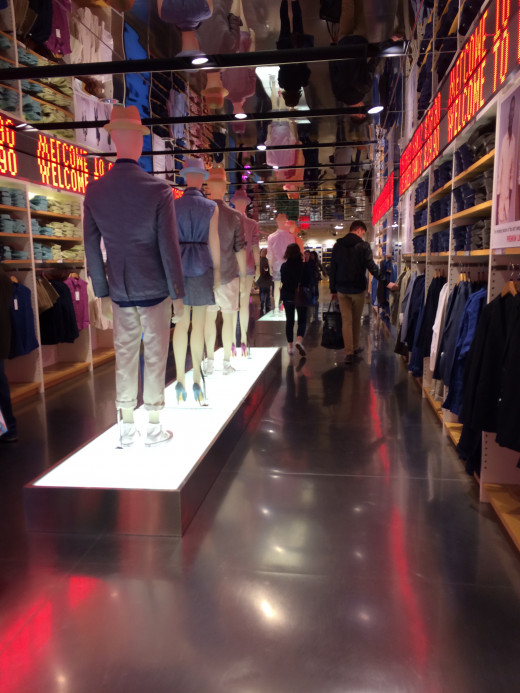
Uniqlo
I went to both stores - Broadway and 5th Avenue. This is a budget brand that have created two, very unique flagship stores in New York. Both have strong visual icons at the stores, that are unique to drive experience instore - all with cutting edge fashion. They have a cool usage if wood and glass to add to the strong visuals. Also created high walls of t-shirts to confirm that it is hip along with a deal with MoMA to display art on the t-shirts. In the 5th Avenue store they have created a mirror tunnel connecting the store up.
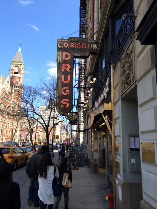
C. O. Bigelow
This is an old fashioned pharmacy in the Greenwich Village district. The brand has developed their own range of cosmetics and sells this worldwide via their website and provides shampoos etc to the Cosmopolitan Hotel in Las Vegas. The shop have not been renovated in 100 years and is tiny, but so hip at the same time. The fit out is the sales as pre WW1 and it is so hip. Has lots of general product you would expect to see in a pharmacy, a prescription desk as well as their own product. Experience once again over function.
So these are my selections of the best shops that I saw on my travels. In the next article we explore the other shops, the also rans, which are a combination of interesting technology, some cool fitouts and some poor instore experience.
Cheers Michael
")